
Building success for Crewasis data scientists.
Stakeholders
CEO
Senior Product Manager
Data Scientists
Engineering Team
Responsibilities
User Interviews
C&C Analysis
Low-fi Wireframes
Mid-fi Wireframes
Hi-fi Prototype
Usability Testing
User Interviews
C&C Analysis
Low-fi Wireframes
Mid-fi Wireframes
Hi-fi Prototype
Usability Testing
User Interviews
C&C Analysis
Low-fi Wireframes
Mid-fi WireframesHi-fi Prototype
Usability Testing
Timeframe
3 Weeks
challenge
The data science team needed collaboration, communication, and feedback processes directly with clients to create deliverables more efficiently.
solution
We designed an internal platform with features such as a Home dashboard, a Project dashboard, and an Insights module to centralize resources and communication for easier cross-collaboration.
OUtcome
Data team gained 2 more days of time weekly to analyze and prepare client deliverables without communication bottlenecks.
The problem
The problem
management wants TO IMPROVE collaboration.
management wants TO IMPROVE collaboration.
Management sought to create a better experience for its employees with an all encompassing project management platform. Client goals for this tool included:
Goal #1: Upload/download data sets and files to a centralized resource library (off-boarding Google Drive)
Goal #2: Project management dashboard
Goal #3: Real-time collaboration features
I guided my team through a competitive analysis of work-place tools and dashboards to understand how to complete our users goals successfully.
employees want MORE transparency.
employees want MORE transparency.
We conducted user interviews with the Crewasis data science team and quickly discovered that their needs were different than business goals. Key pain points among employees became integral to the design.
Communication with Client: Data scientists mentioned they could not ask clarifying questions or receive client guidance for next deliverables because client communication was only through CEO.
Centralized Feedback: 70% of users reported feeling confused when receiving feedback across multiple platforms across different stakeholders. This made it difficult to iterate on the next deliverable.
Transparent Collaboration: Few multi-edit documents for teams to work on together, efficiently.
After conducting user interviews with the Crewasis data science team, we quickly discovered that their needs were different than business goals. Upon analyzing responses, we identified key pain points among the team that became integral to the design:
Transparent Collaboration Few multi-edit documents for teams to work on together, efficiently.
Centralized Feedback 70% of users reported feeling confused when receiving feedback across multiple platforms. This made it difficult to iterate on the next deliverable.
Communication with Client 40% of data scientists mentioned they could not ask clarifying questions or receive feedback for next deliverables because client communication was only through CEO.
priority features
priority features
Home Dashboard
To accurately capture the data scientists' needs, I led a card-sorting activity to ensure an intuitive, user-centered layout. We uncovered preferences for dashboard hierarchy and essential features, and created user flows that would best support these processes.
To accurately capture the data scientists' needs, I led a card-sorting activity to ensure an intuitive, user-centered layout. We uncovered preferences for dashboard hierarchy and essential features, and created user flows that would best support these processes.

We developed a mid-fidelity prototype of the Home Dashboard for user testing. Feedback revealed that 75% of users felt the interface was overcrowded, experiencing option paralysis that led them to click carelessly through buttons to complete tasks.
In response, we streamlined the dashboard by reducing on-screen features and relocating items to a side navigation menu, resulting in a cleaner layout and more intuitive organization. Reviewing changes with the users confirmed that these updates made the interface less daunting and very efficient.
We developed a mid-fidelity prototype of the Home Dashboard for user testing. Feedback revealed that 75% of users felt the interface was overcrowded, experiencing option paralysis that led them to click carelessly through buttons to complete tasks.
In response, we streamlined the dashboard by reducing on-screen features and relocating items to a side navigation menu, resulting in a cleaner layout and more intuitive organization. User testing confirmed that these updates made the interface less daunting, with 100% of users completing tasks 60% faster with the hi-fidelity design.

midfi
midfi

hifi
hifi

hifi
To accurately capture the data scientists' needs, I led a card-sorting activity to ensure an intuitive, user-centered layout. We uncovered preferences for dashboard hierarchy and essential features, and created user flows that would best support these processes.
Project Dashboard
We designed a project dashboard to centralize all project related files and communications in one spot. However, user testing on our mid-fidelity prototype revealed that 75% of users were unable to find Team Deliverables in a timely manner due to the lack of hierarchy in the design. Users also mentioned wanting a more prominent Activity Feed to keep stakeholder communication and feedback top-of-mind.
To address the issues, I refined the design to better highlight team deliverables and the communications happening within the project. A hi-fi review with the team confirmed that the Team Deliverables CTAs at the top were 100% more noticeable. Users also enjoyed the Activity Feed modification with the ability to switch between different types of commentary on one feature.

midfi
midfi

hifi
hifi
hifi
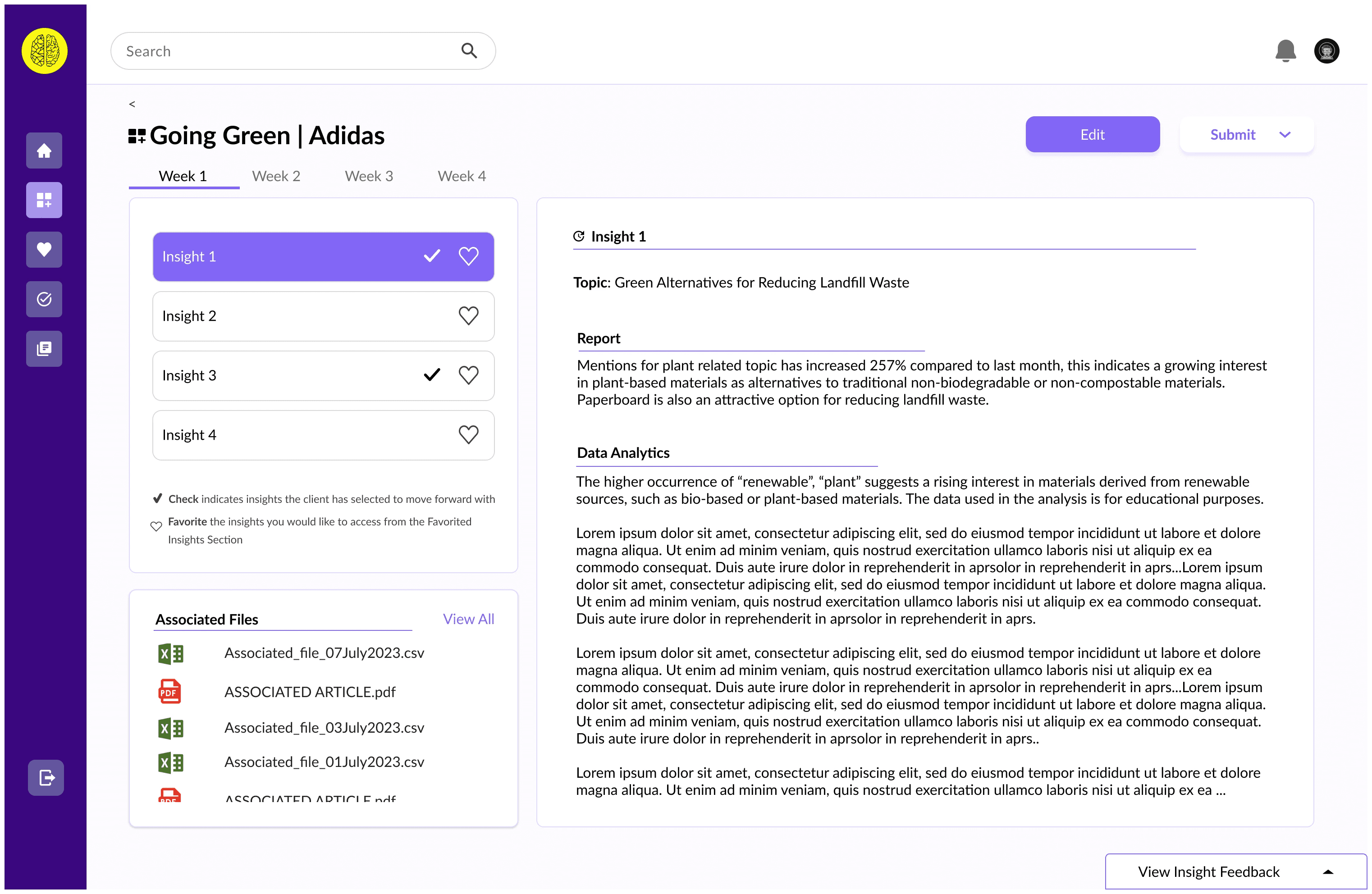
Insights
Data scientists needed to present weekly deliverables in four-week sprints. We designed a Project Insights page that displayed a summary of each deliverable, as well as access to the related files for quicker browsing. 100% of users were able to navigate within the page and edit the deliverable with ease. However, users continued to want access to feedback, so we added a chat-like feature for reference to communication for each specific deliverable topic.
With few modifications, this design centralization reduced friction in accessing files and feedback, aligning with the team’s sprint structure.

Data scientists needed to present weekly deliverables in four-week sprints. We designed a Project Insights page that displayed a summary of each deliverable, as well as access to the related files for quicker browsing. 100% of users were able to navigate to a project's insight and edit the deliverable with ease. However, users continued to want access to feedback, so we added a chat-like feature for reference to communication for each specific deliverable topic.
With few modifications, this design centralization improved user efficiency by reducing friction in accessing files and feedback, aligning with the team’s sprint structure.
Lessons Learned
Lessons Learned
Understanding the full process
It wasn't until the conclusion of the project that one of the principal data scientists brought up how the teams monitor project progress. This insight was vital since we were developing a progress tracker. In hindsight, I would have sought to question the intricacies of the work management process so we could tailor the feature to their specific work flow.Project timelines and incentives
Due to our limited time, we couldn't carry out a second usability test. Our project faced challenges with time management due to delays in receiving responses from the client. If we had provided more incentives for data scientists to engage in our research and user testing, it's possible that our timeline would have been shorter, allowing for more extensive testing and smoother implementation in the future.Team guidelines
It was only during this project that I came to recognize the significance of team guidelines for fostering a smoother dynamic during sprints. These guidelines helped us manage disagreements, communications, and decision making in a swift manner to help us complete our sprint.