
Overview
Timeframe
3 Weeks
stakeholders
CEO
Systems Manager
responsibilities
User Interviews
C&C Analysis
Low-fi Wireframes
Mid-fi Wireframes
Hi-fi Prototype
Usability Testing
A Swift FX Transaction with Goza.
CW Express Centro Cambiario has dedicated their business to foreign exchange in the city of Mexicali BC for more than 50 years. Primarily an in-person queue to exchange cash, CW Express wanted to create an app and debit card to meet the needs of modern users.
I was asked to review the preliminary prototype. Through user testing, I found that design choices didn’t effectively address either the business objectives or user needs, and the core features had unfinished work flows.
To address these issues, I re-designed the Home screen, and created new features for users to obtain upcoming orders and complete FX transactions.
Conducting user testing on my prototype, users mentioned a large increase in task efficiency and usability, reducing user confusion and anxiety around money management.


Defining goals
Client wants to increase transactions.
CWExpress leadership wanted an app that met the technology standards of today's banking environment, and created convenience for customers. Taking these into account, I determined the following product goals for this app:
Goal #1: Seamlessly complete foreign transactions (MXN / USD)
Goal #2: Facilitate deposits into Goza debit card
Goal #3: Facilitate convenient withdrawals, digital or physical
the problem
Customers want convenience.
In addition to reading past user interview notes, I conducted my own to understand user habits in the mobile banking space. New insights emerged, including:
Time Constraints: "I don't have the time to stand in line for errands. The faster I can complete tasks, the more time I have to enjoy my day."
Convenience: With the rise of technology, tasks can be done with a few clicks on the phone. "I like when mobile apps can help complete my tasks. Modern technology can complete errands pretty conveniently."
Informative: 4 users who mentioned being financially savvy said they like to know the whereabouts of their money, and current transaction rates. As cash is hard to track, users enjoy tracking their transactions on a mobile app for easy accounting.
Accessible: "Mobile apps make information accessible 24/7/ I'm able to view my balances from anywhere with an internet connection at any time."
User testing for new iterations
Improving Usability From The Start
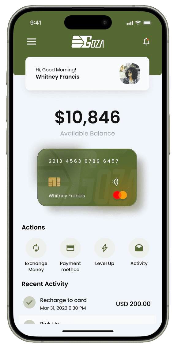
Testing the initial design, 4 out of 5 users mentioned that the home screen invoked confusion as users didn't know where to navigate after logging in. They noted that the credit card image was too large, and they did not enjoy having to scroll around to view different summaries.
To improve the visual hierarchy, I conducted a closed card-sort to assess the information architecture and user expectations of the home screen. Analyzing the results, I designed a fixed menu to link users to core features of the app, and ensured all feature summaries were above the fold for easier information access. I also displayed the current exchange rate to help users make informative decisions.
User testing confirmed these updates made the app more intuitive and aligned with expectations, with 100% of users completing a task faster than with the preliminary design.
Before

After
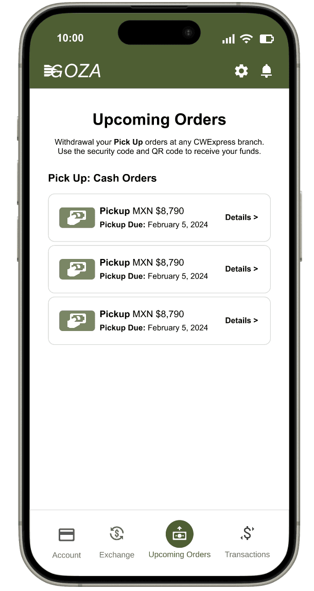
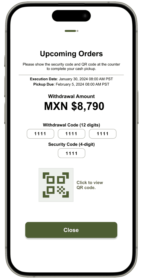
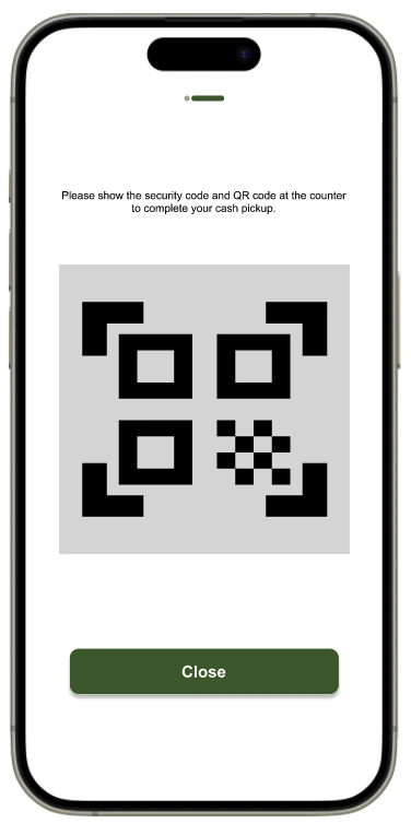
QR Codes For Efficiency
With the preliminary design, I asked users to complete a core task: withdrawing funds for an upcoming money order pickup at the bank. On average, it took users 45 seconds to find the starting point of this workflow. Many expressed frustration that this essential feature wasn’t more prominent, as it was critical to their money withdrawal process.
To address this pain point, I decided to move this essential feature to the fixed menu bar for quicker access. I then focused on creating a streamlined experience that prioritized speed, simplicity, and security with the teller. I chose to integrate QR code technology for money order pickups as QR codes have become a standard in modern mobile experiences, widely adopted across banking apps and other industries.
During subsequent user testing, 100% of participants were able to locate their Upcoming Orders QR code within seconds. Users enjoyed the QR code experience, noting it felt intuitive. They found the task easier to complete with the feature prominent on the new menu bar.


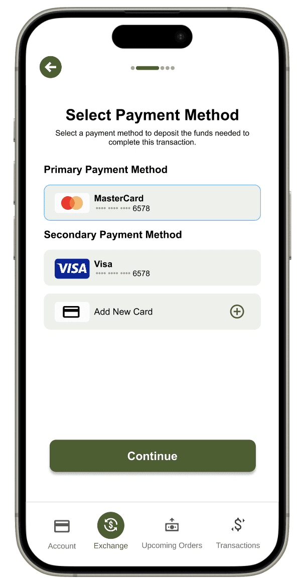
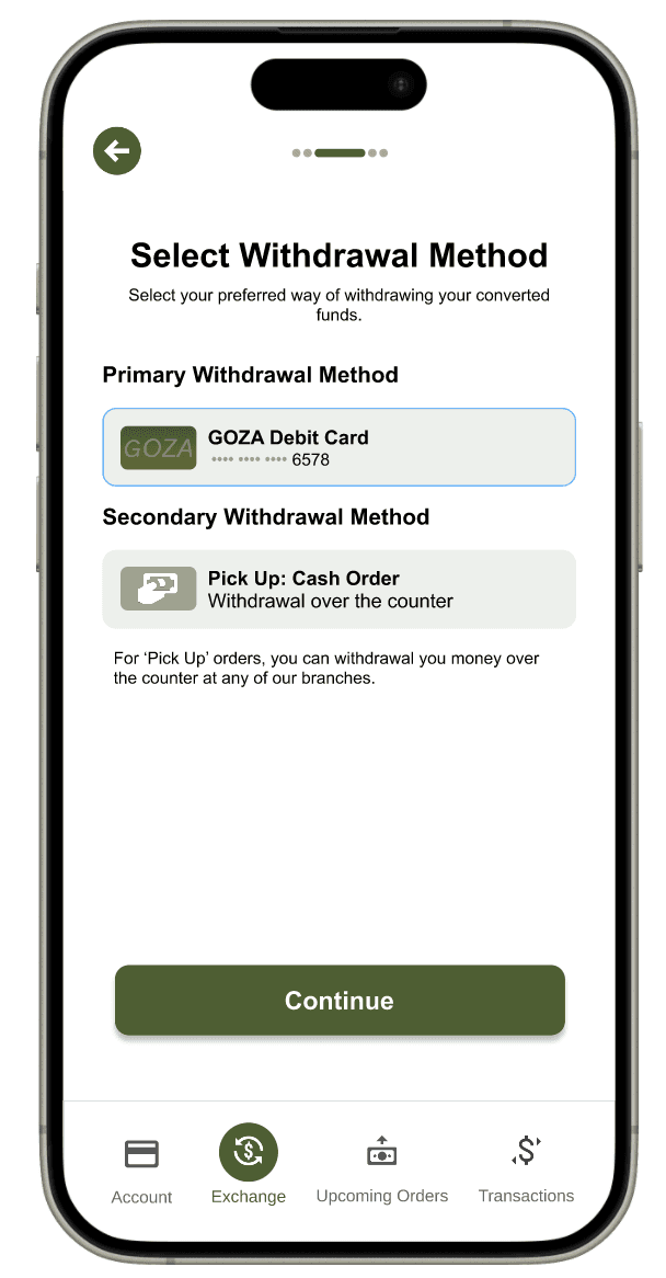
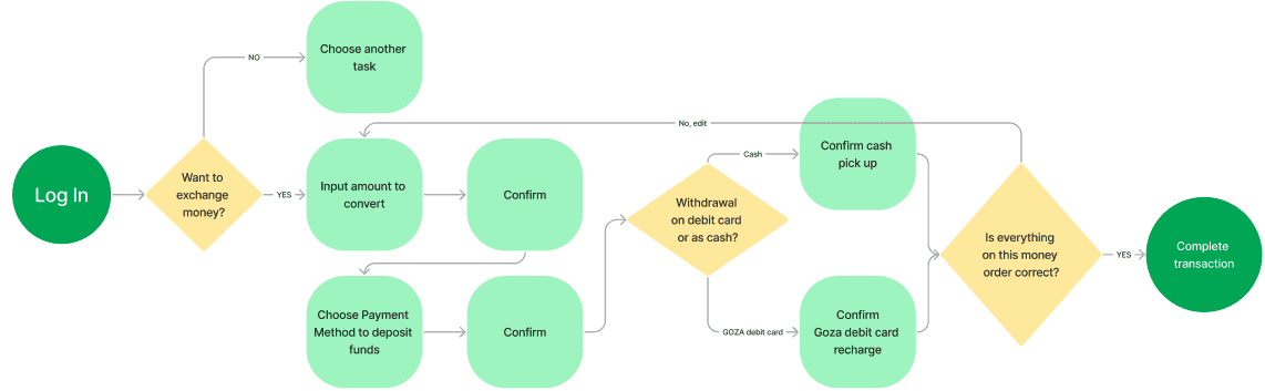
Complete User Flow for FX Transaction
To support the primary product goal of enabling users to deposit and withdraw MXN/USD seamlessly, I designed streamlined workflows inspired by familiar elements from established banking apps (Wise, Chase, Citi). My aim was to create a smooth, intuitive flow that would allow users to exchange and access funds with minimal friction, regardless of preferred withdrawal method.
After mapping out the essential inputs needed to complete a FX transaction, I asked users to complete a FX transaction with the new design. 100% of users were able to complete the task, with little to no confusion on the instructions provided. Users liked how accessible this feature was on the menu bar, and how familiar and logical the steps were to complete the transaction.


Lessons Learned
Understanding the business and user goals
During my review of the preliminary designs and user interviews, I noticed design choices and features that didn’t effectively address either the business objectives or user needs. It became clear that a deeper understanding of the business’s core services was missing, leading to a misalignment between what the app showcased and what users actually valued. This experience reinforced the importance of selecting and highlighting features that not only meet business goals but also resonate with user expectations.Money Literacy
Through my own research, I found that the spectrum of financial literacy and foreign exchange can vary. It's important to simplify all user flows so that each feature can be accessible regardless of the knowledge and experience users may have on fx transactions.Specifying Copy
Because financial vocabulary can be confusing, it's critical that the copy be accurate and differentiated on the app. When I was creating labels, I would second guess my use of words (ie "Exchange" vs "Transaction") as it came too similar to context that would later be seen on a different page.